Merging and rebranding a platform for artists and cultural entrepreneurs from Arnhem and Nijmegen

Art is the foundation for culture and society, and no one knows this better than the people at Cultuur Academy and Schakel 025. Both created platforms to support artists, either with funds and subsidies or useful information and workshops. In 2022 they decided to join hands and merge into Cultuur Academy and asked us to do the rebranding and create the platform.
A modern rebranding with a shout out to the past
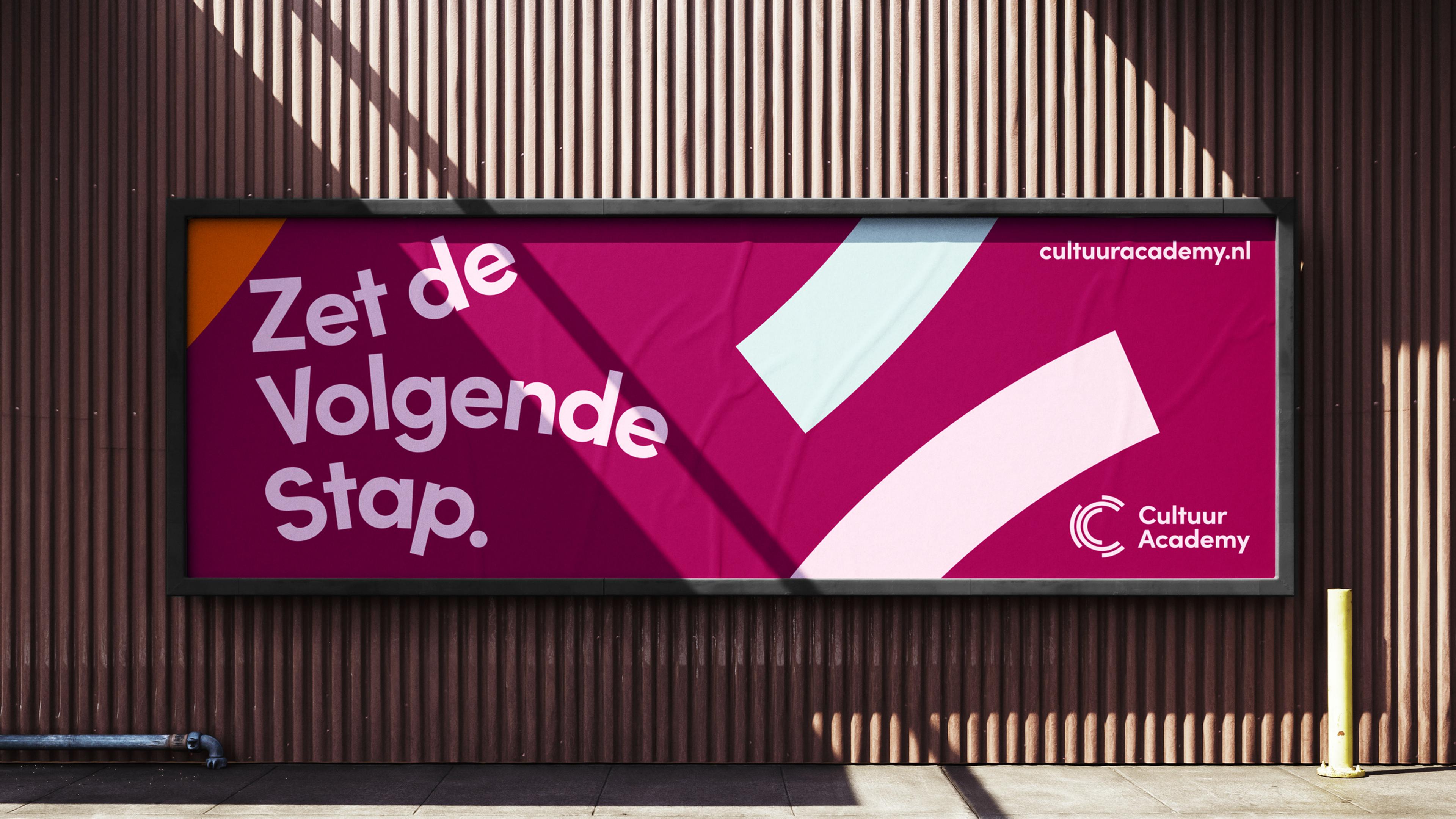
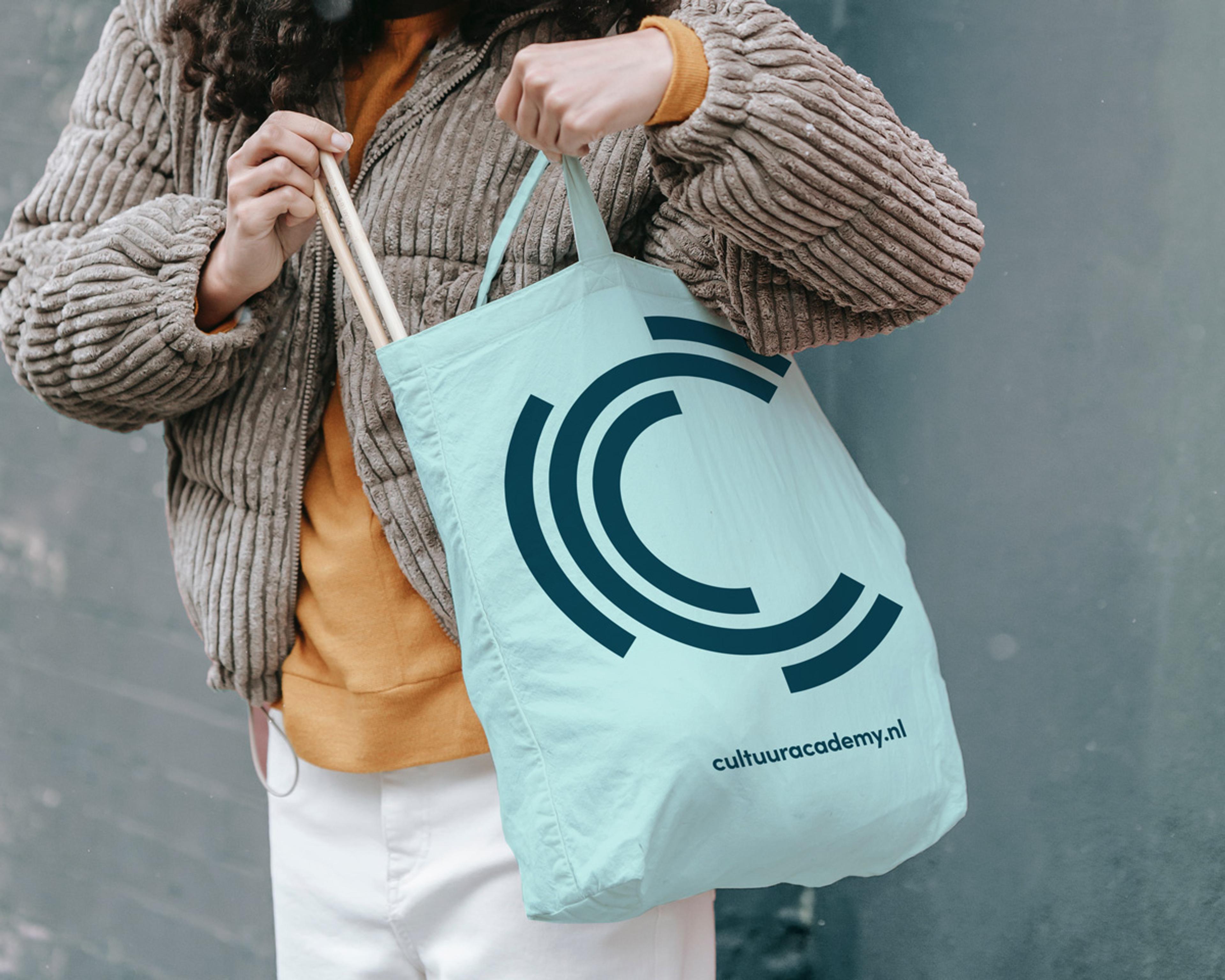
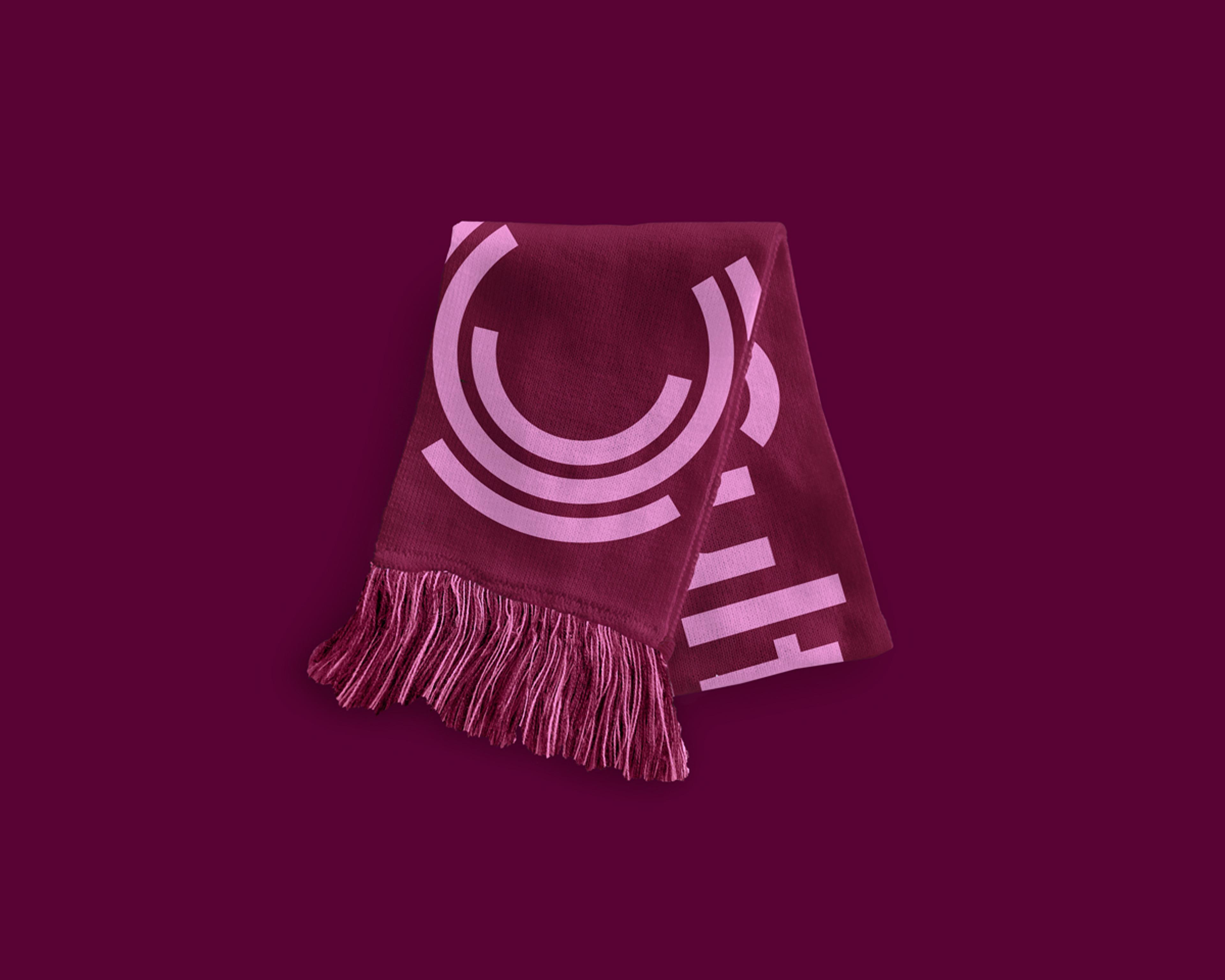
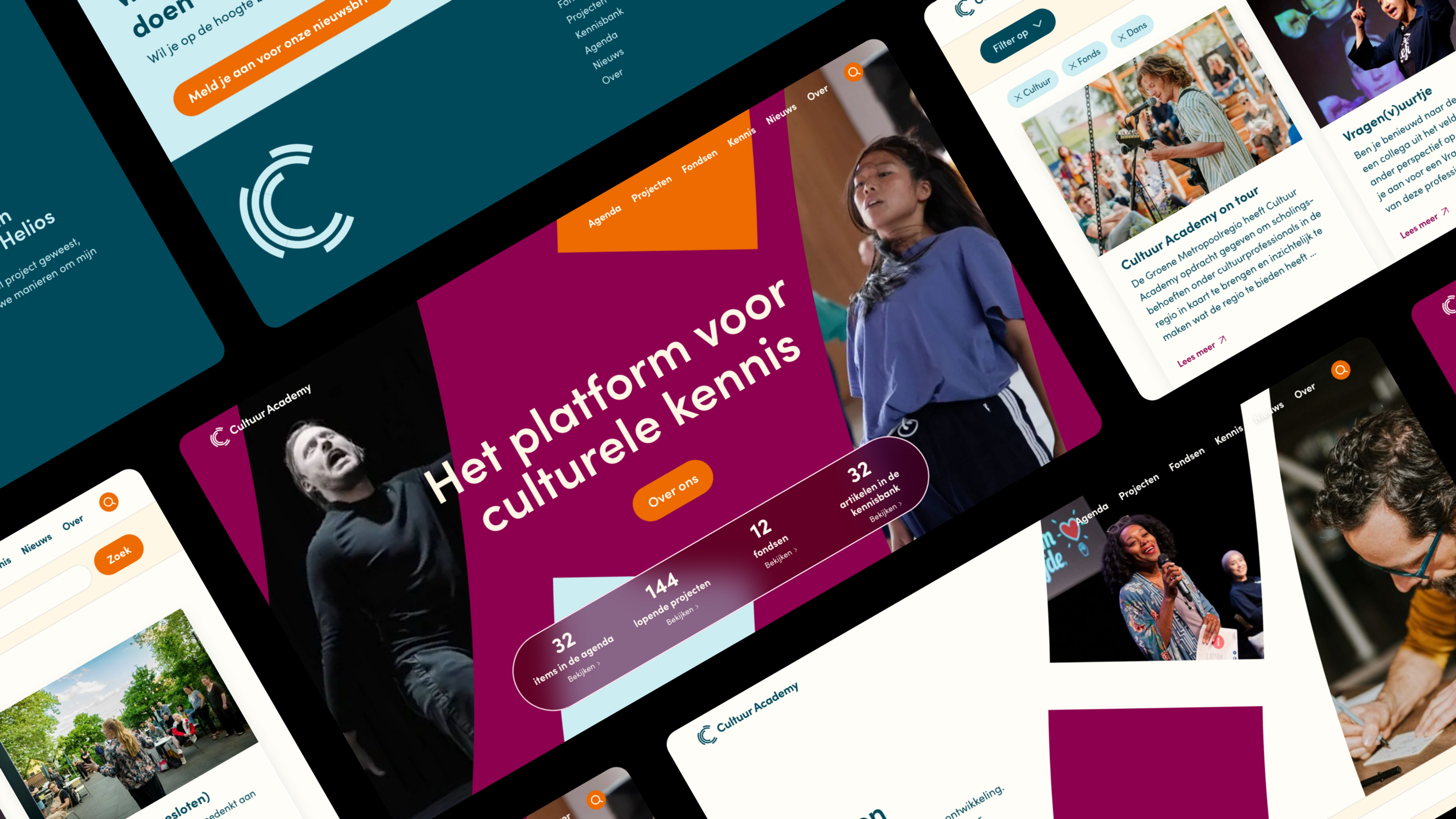
The good people at Cultuur Academy wanted to retain some elements of their previous brand to make sure their current audience would still recognise them. We took the semi-circles and added bold new colours and motion to them, making them come alive and grab the viewers attention.
Designing a digital knowledge base for artists and cultural entrepreneurs
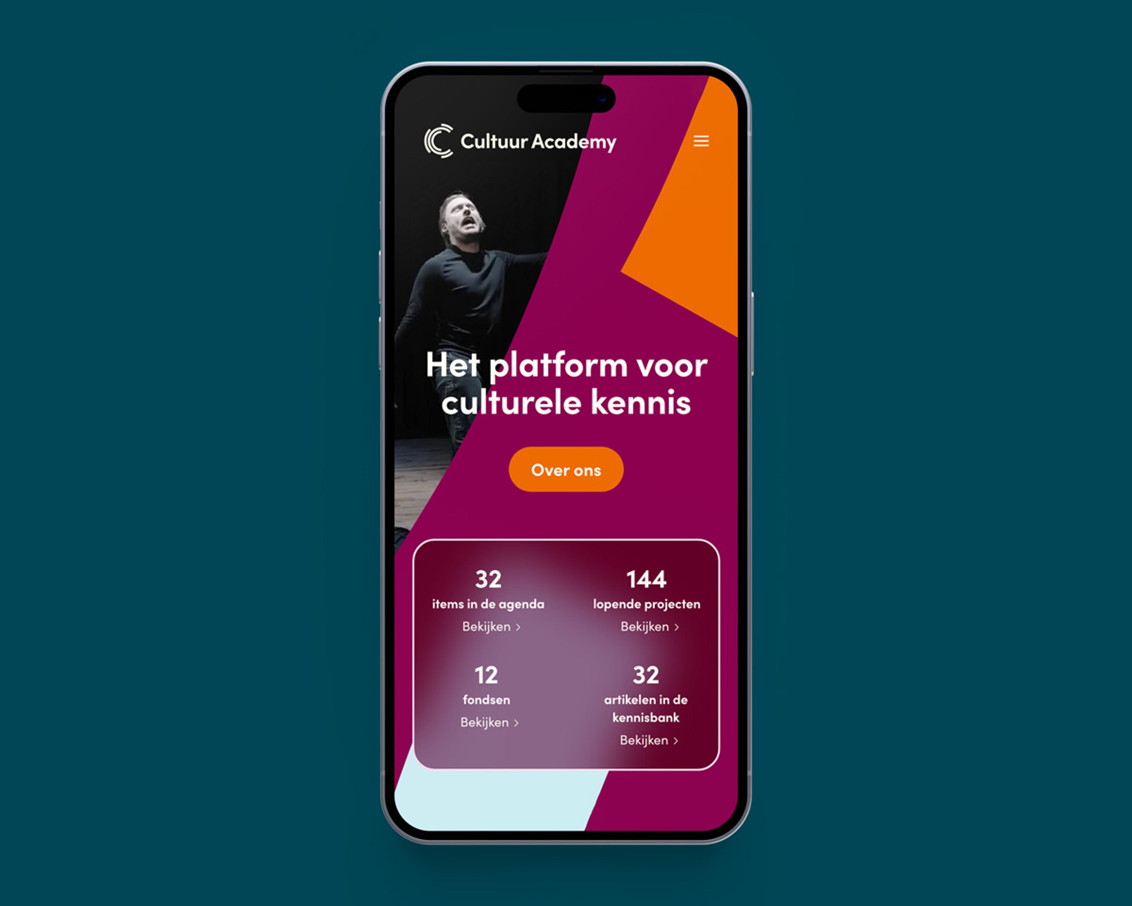
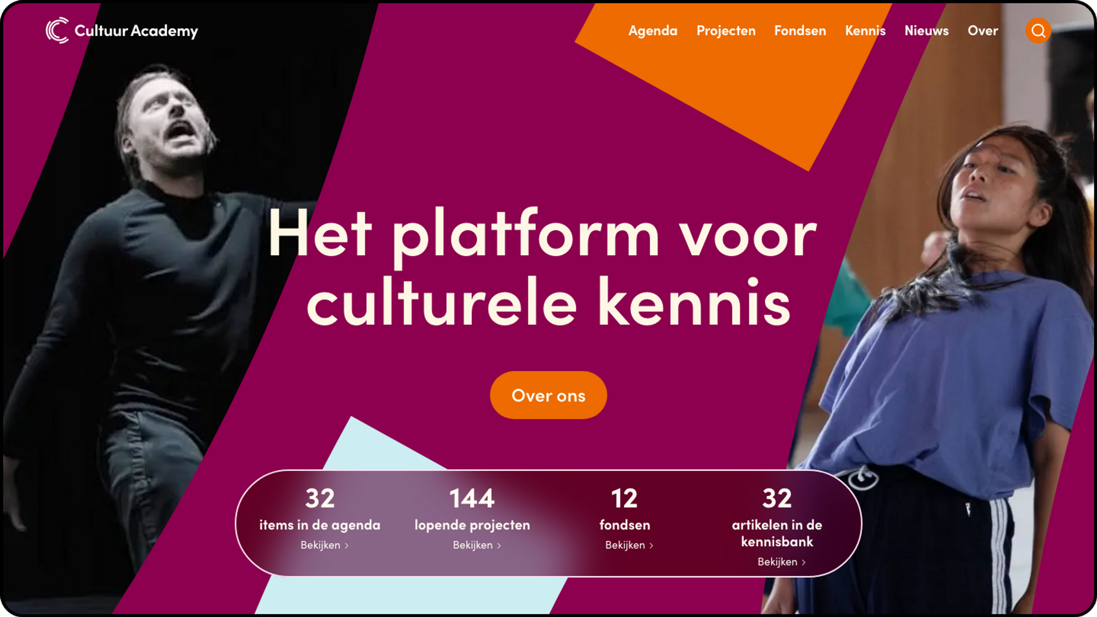
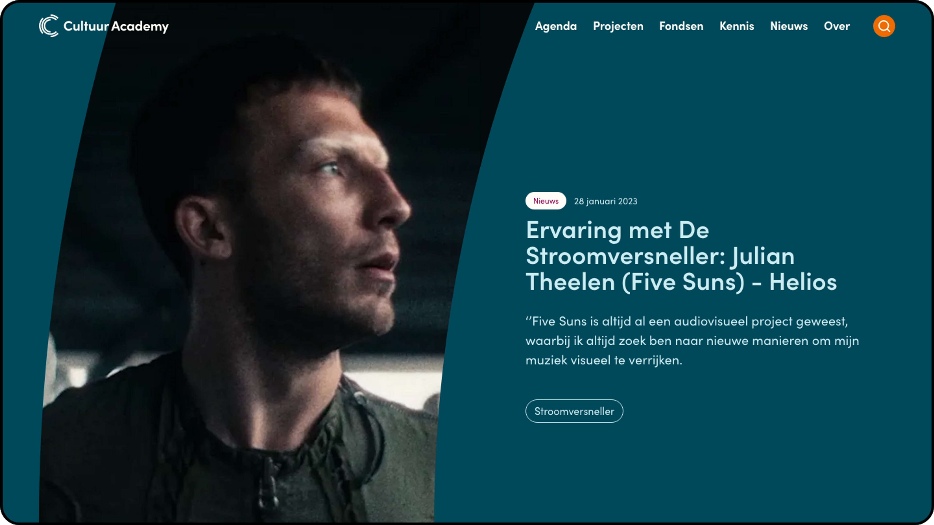
The cultuuracademy.nl platform has a wide range of content like events and workshops, a knowledge base, different types of funds, projects, people and more. To make sure all this content remains comprehensible while also making the brand shine we spent a lot of time creating a solid and accessible design system. The admins can create their own content using a custom made article-builder with building blocks for text, images, video and so much more.
Making the platform as smart and future-proof as possible
With over 200 useful articles in the website, it’s important to help users find exactly what they’re looking for. That’s why we used Algolia to index all the content on the site. It uses machine learning algorithms to find the best results for a search query and generates related topics based on user behavior. And the cool thing is, it only takes 7 milliseconds to generate a response!
A note on accessibility
Anyone can be an artist or cultural entrepreneur. That’s why we made extra sure the platform was accessible following the WCAG standards. Cultuur Academy asked a panel of users with various different ways of accessing the content on the platform to perform certain tasks. The result: they were pleasantly surprised by how easy it was, especially the signup forms for events and funds.
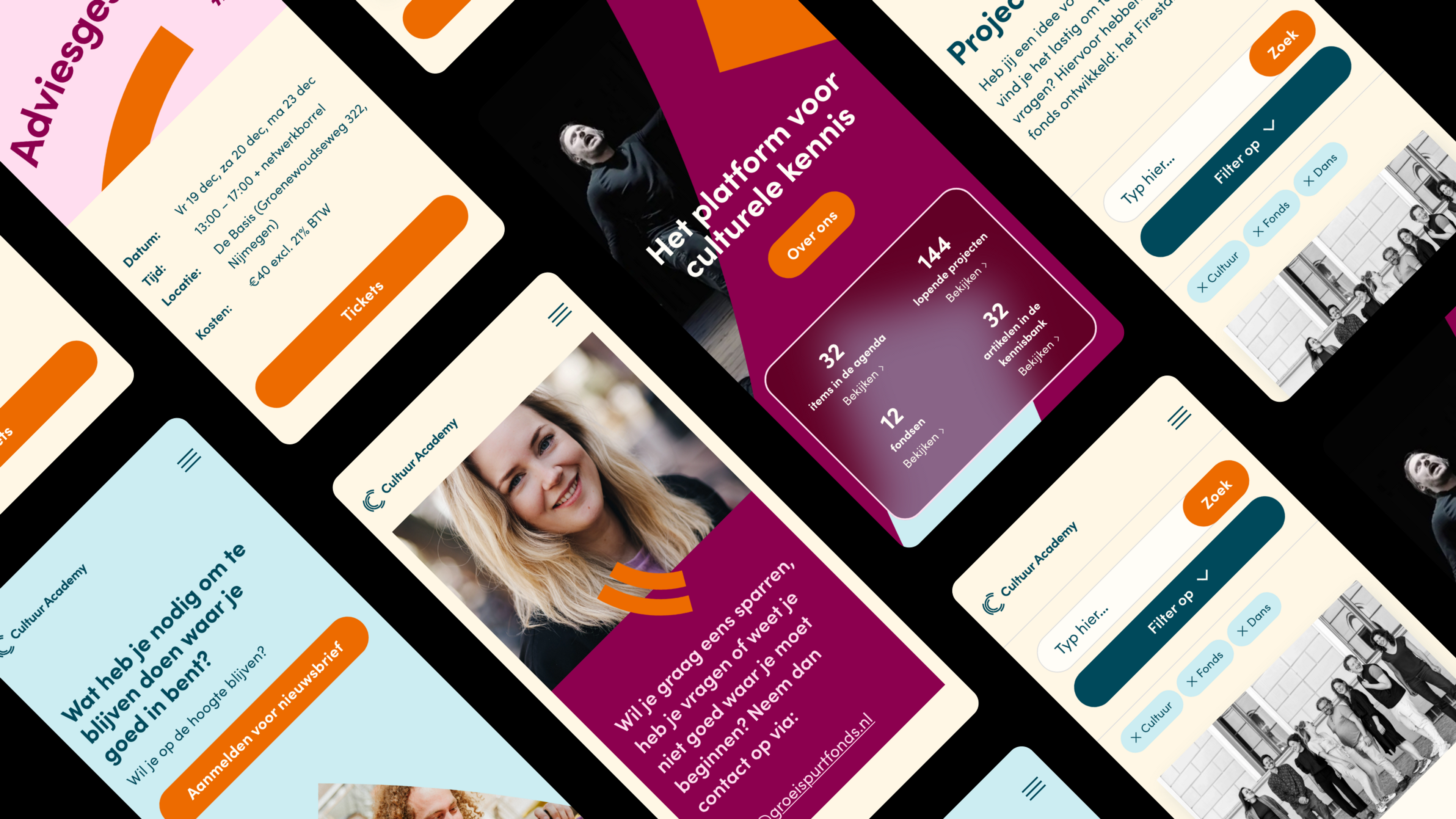
Since the launch of the new brand and platform, there have been thousands of visitors and hundreds of signups for events, and we'll continue monitoring the site and improve where necessary.
Branding & Motion | Vincent Hammingh |
UX/UI Design | Harm van der Burgt |
Web Development | Marcel Klein Legtenberg |
